

It's been too long since we took the time
No-one's to blame, I know time flies so quickly
But when I see you darling
It's like we both are falling in love again
It'll be just like starting over, starting over
Yes, once more, against all odds, here is another Spinner Rack Junkie- that more-or-less ongoing feature in which I write "too short to be real" reviews of various works of sequential fiction that I have perused in the interval since the last time I inflicted said "too short to be real" reviews upon one and all, or to be specific, the period from approximately 25 December to 6 January, some of which may even still be on sale at finer comics selling establishments worldwide if you're lucky. Or not, as the case may be.
THE BLACK DIAMOND #6: Far be it from me to be excessively critical of a comic with such excellent taste in pull-quotes, but I do have a few things I'd like to mention. I was delighted to note that even though I didn't read #'s 3 and 5, I had no trouble understanding this issue's ending, and it was a satisfying one- even though the whole "'deuce' ex machina" thing was a little frustrating, because I sure would have liked to have known what happened next. You know how I am about ambiguity. Larry Young's expository dialogue in the first few pages was breezy and well done. I also thought the self-aware placement of Young's script directions was a great touch, and in some odd way reinforced the stated intent of the series to evoke 70's drive-in road pictures. The juxtaposition reminded me a bit of the real-world-reveals of, say, Dennis Hopper's The Last Movie or even Mel Brooks' Blazing Saddles. That said, I think Larry's biggest mistake on this entire series was to hitch his wagon to artist Jon Proctor; while he does have some design chops, too often his figure and vehicle renditions look too obviously lightboxed, and not very well- what's happening with Kate's nose on page 1 and 5, to name one example- his coloring is often unnecessarily garish and monotonous, little pop-art touches like the first panel of page 7 are left-field and seem to serve no discernible purpose, and I seriously doubt if he's even seen the "great helicopter shot at the end of Easy Rider". The art (well, that, and my disbelief that people would be willing to put up with having cars fall on their heads) was the main thing that kept me from enjoying this series as much as I probably should have, and I hope that if Young is able to continue the series, he finds a more sympathetic and talented collaborator. In fact, I'd suggest that he look no further than some of the back feature artists; this issue's, by Filip Sablik, was especially good despite some more garish, ugly coloring. B-
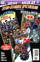
BRAVE AND THE BOLD #9: Waid and Perez continue to sprinkle superheroes like confetti on our heads at a New Year's party. It's quite overwhelming sometimes, especially since Perez' art is virtually synonymous with overwrought clutter and chaos, but the sum is so pro-adventure and pro-fun that it's hard not to like it in spite of itself. I would imagine Kurt Busiek is jealous. B+
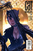
CATWOMAN #74: It's regrettable that someone in editorial felt like they had to sex up Adam Hughes' already great cover, to which Hughes responded by making Selina look like Audrey Hepburn with big tits...but really, that doesn't matter to the great unwashed out there...the ones who buy the book anyway. The interior is the important thing, and it's solid as usual, if a bit contrived- all the better to shoehorn in a licensed property that just doesn't belong in the latest 52/Countdown/et cetera-type company-wide profit-taker. I was a lot more interested in seeing Selina settle up with "The Thief" than I am in finding out how she copes with being on another planet with The Joker and King Croc. B+
DAREDEVIL #103: Like sands through the hourglass, these are the days of Matt Murdock's life. Actually, this time around there's a bit more of DD bouncing around and beating up thugs, and even threatening to go all QT on the Ox. It works, because Brubaker is good, but I'm not really enjoying it much. A-
HELLBLAZER #238, 239: Gotta own up to an oversight here- I was in such a rush to complete the last SRJ that I forgot to mention how much I liked #238; as drawn by Dan Zezelj, it pitted Constantine (being manipulated, as it turns out, by heretofore mostly benign spirit-of-London character Map) against the personifications of some urban legends in another dimension on the other side of a bridge, trying to rescue some unfortunate journalist types who unknowingly crossed over. Nicely done suspenser, giving John the chance to be a good guy as well as a bad-ass for once, and the urban legends thing reminded me of the halcyon Grant Morrison Doom Patrol early-Vertigo days. Nice job all around. In #239, Leo Manco is back in the first part of what would seem to be a multi-issue saga that involves some horrible African magical menace, and the sacrifice of one man to get a warning to John in England. Again, nicely done, if a little gratuitously gory, and bodes well for the rest of the story arc. #238: A-; #239: B+
IMMORTAL IRON FIST #11: Everything seems to be coming to a head very soon as the tournament continues, Hydra gets closer to crashing the competition, and Danny reunites with Luke Cage, Misty Knight and Colleen Wing, who have been searching for him. The flashback tale this time is just as rousing, featuring the tale of Davos, the "Steel Phoenix"'s first encounter with Shou-Lao the undying big-ass dragon, and featuring the art of none other than Kano, whose art was a big reason to pick up the early issues of DC's H-E-R-O, and whose work I haven't seen since a short stint on the much-missed Gotham Central (Thanks, Dan!). Lotta bang for your bucks with this title. A-
IRON MAN: ENTER THE MANDARIN #4: I suppose this series, if anybody was paying attention to it in light of the current ongoing dreary Marvel line-wide "event", is the vindication of Tony Stark and his armored alter-ego. This is a cool, rico suave Stark, confident and capable and yet not a bastard, like he useta be back in the day. This issue introduces more early 60's spy-movie stuff into the mix, as well as a nifty digression involving the Crimson Dynamo, another early villain, and I'm finding this a very good read. It's also great to look at thanks to Eric Canete's art; he has a great sense of dynamics and pacing. A-
WASTELAND BOOK 02: SHADES OF GOD: I don't really have much to add from when I reviewed the first trade; There's still nothing happening here that will be new or fresh to you if you've read any post-apocalyptic fiction at all, and it's still weird to read the characters dropping f-bombs and otherwise cursing like real people do, except they substitute "sun" for "God", as in "sun-damned". There's also (with me, anyway) a real problem with such a large cast of characters, and keeping them straight; artist Chris Mitten really doesn't help much in this case. All his women look the same, with only darker wash tones used for hair, and his men are mostly distinguishable by whether or not they have stylin' razor-cuts or long hair and beards. Also, there just isn't enough contrast in his black-and-white art; too often we're given entire pages of nothing but scratchy thin linework, only broken up by wash tones no darker than perhaps 40 percent black. In spite of all this, and even though I think I know what the big reveal's gonna be when the two main characters get where they're going, I remain won over by its ambitions (secondhand as they may be) and interested enough to keep buying the trades. C+
NOTES: Boy, I was dealin' out the A's and B's this time, wasn't I?
DCBS seems to be sending me my comics weekly these days, so I had hoped to include NORTHLANDERS #2, OMEGA #4 and LOBSTER JOHSON #5 here, but thanks to the holidays I didn't get 'em on Friday so it will be next time. I also keep meaning to finish SUPER SPY and LUCHA LIBRE #2, and perhaps I will by the next column. Sayonara!

No comments:
Post a Comment