
5 CAPTAIN AMERICA COMIC BOOKS I HAVE OWNED AT SOME POINT OR ANOTHER, PLUS ONE I DIDN'T.
With commentary!
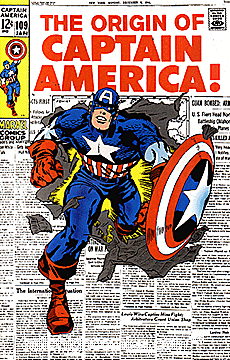
#109, which was a Lee/Kirby retelling of Cap's origin. Nothing much else to say except I liked the way they had Cap bursting out of the newspaper. The pose is a bit sedate for Kirby at the time.
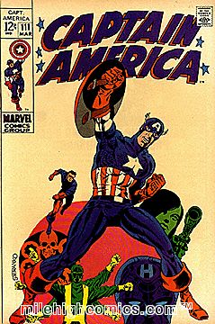
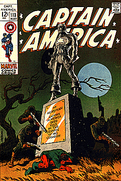
Two from Jim Steranko's short-lived stint on the Star-Spangled Avenger. The first one (really poor scan, by the way- had to gank these from the Mile High Comics site since the Grand Comics Database is conveniently down) seems like it's missing something; I wonder if Steranko didn't have more stuff in the upper half of the illustration, and Vince Colletta or some other hack didn't remove it so the logo would stand out. Who knows. The more I see original art and scans of same, the more I notice (most often to my dismay) how much tinkering, cutting-and-pasting, and revising was done to all those old classic Marvel covers. You'd think, given the talent involved, that they could run a Kirby or Ditko or Colan or whatever cover as is, but that doesn't seem to be the case. Anyway, I have no idea if that's the case with that first Steranko Cap; I'm just rambling. Lord, I was born a rambling man. I've always liked the mood Jim evokes in that second one- reminds me of that great story he did for Tower of Shadows.

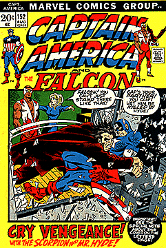
Gene Colan now. Out of all the clasic work that Colan did for the House that Stan and Jack (and Steve) Built, I've always thought his Cap stuff was some of his best, and most overlooked. His loosey-goosey, but always dynamic, style suited the rough-and-tumble, acrobatic world of CA really well. I like the arc of Scorpion's tail, drawing the reader in and making him/her feel the impact. Colan's Scorpion was good- something about the loopy lines of the character's uniform played to Colan's strengths.
I don't necessarily think this is a great cover; seems to be Gil Kane heavily inked by someone, Jim Mooney perhaps. I just remember being excited when I saw this on the rack at age 12 or so. I was all "Holy crap, how's Cap gonna get out of that one?" Oh, the naivete of youth. Anyway, pretty much conveys the gist of this issue's contents, huh!

I didn't buy many issues of Cap after 1974 or so; I did get John Byrne's short-lived stint (I think Steranko lasted longer, actually) which I thought was pretty good. After the early 70's, there followed decades of really anonymous-looking, uninspired, tedious covers, with an occasional good Mike Zeck illo from time to time. I don't think the interiors were much better, although I realize that many are fond of several of the runs, such as Mark Gruenwald's 80's tenure. Jack Kirby did more issues than I thought when he returned to Marvel back around '76-'77; he had some typically gonzo ideas but his approach just didn't really mesh well with the character by that time. I thought it was kinda sad. Anyway, I digress- the above cover is from the Marvel Knights Cap series, which I never bought but kinda admired the iconic renditions of the first dozen or so covers from a distance. Also like the logo by John Hancock, a neat idea that doesn't work so well in practice (doesn't really stand out) but I think it's clever.
Happy Independence Day, everybody. Don't blow a finger off with an M-80 or anything.
PS: Yeah, I know, Tom Spurgeon has already done it, but I had the idea last night, OK?
No comments:
Post a Comment