Showing posts with label art appreciation. Show all posts

Sunday, June 05, 2011

What? No Dr. Goldfoot and the Girl Bombs?


Some people are just so clever and creative. It's sickening.

All seriousness aside, please click through and check out this awesome series of drawings of the late great Vincent Price, who would have turned 100 a few days ago, each on a post-it note and each featuring his likeness in most of his films and television appearances, by Zach Bellisimo. I like how Zach draws Price in each of his disguises in Theatre of Blood, to name one example, as well as including Vincent's animation voice work.

And yeah, I know- while there were two Dr. Goldfoot films, he pretty much looked the same in both of them. I was kinda hard up for a post title, OK?

Wednesday, September 15, 2010

RIP Jerry Grandenetti.

Word has reached the Internet, and by extension me, that Jerry Grandenetti passed away back in February. You may recall, if you've been reading my blog for any period of time, that I have written several posts praising his work in the 60's and early 70's, especially in the black and white Warren Magazines line, via titles like Creepy, Eerie and Vampirella. Although I was infatuated with the work of many of the artists represented in those pages, such as Alex Toth, Reed Crandall, Steve Ditko, Gene Colan, Wally Wood, Angelo Torres, Al Williamson, and many others, none of them grabbed my attention or captured my fancy like Grandenetti's surreal, expressionistic, almost hallucenogenic renditions of (mostly) Archie Goodwin's stories. Here are links to two previous posts, one an entire story, a personal favorite called "Rub the Lamp", and a single page from a later story called "Type Cast". As the years went by, I would read a bit about him here and there; I soon became acquainted with his work for DC, especially his run on the 60's Spectre, succeeding Neal Adams, inked by Murphy Anderson. The difference in styles was too jarring for many, and eventually the book was cancelled. Like Frank Robbins when he took over from Mike Kaluta on The Shadow several years later, fans didn't take it well...but I really liked his stint, although it wasn't until the mid-70's that I read them. Eventually, I found out about his beginnings working for Will Eisner, and his stint on DC's war comics. After a while, he moved into the greener pastures of advertising, but kept his hand in by illustrating a hodgepodge of things for DC in the 70's, mostly Joe Simon projects like Prez and in the pages of First Issue Special, The Green Team and The Outsiders. Sadly, his work was unappreciated by many at the time, who only seemed to appreciate the flashier, more modern-style artists of the next few decades. Regardless, I never forgot the charge I got from that 60's stuff, and he became one of the artists I was always evangelizing about to whoever would listen. When I started blogging, I was excited to discover his website, through which he solicited commissions, and I always thought it would be so great to get him to do something for me, but alas I never could afford it. The website is no longer online.

Anyway, short story long, of all the great artists I've admired, appreciated and loved over the years, few have given me as much pleasure as Grandenetti did in the 60's, my formative years. His was such a challenging style, it definitely could be an acquired taste, so I can see why it didn't receive the accolades I thought it deserved. In way of tribute, I want to post a series of pages and covers from different points in his career; I hope it will provide some insight into his talent and yes, genius, and perhaps enlighten you about why I revered it so. It's a very incomplete sample set, but I hope it will be satisfactory.


Two Eisnerish Dr. Drew pages, via Four-Color Shadows.


War comics covers for DC, many done with wash tones.


The uncut funk here, Warren pages from Creepy and Eerie. Grandenetti also did several stories as a ghost for Joe Orlando. Now, some DC pages from roughly the same period; the Spectre pages are inked by Murphy Anderson:


And from the 1970's, Prez and the Green Team:


Always wanted to see a Batman-Green Team teamup. You'd think the cartoon guys would be up for that. Anyway, finally, the one page bio that appeared in Creepy #42:


And that's all. Rest in peace, Mr. Grandenetti, and thanks for everything.

Thursday, August 05, 2010

The Power of Love.


Gosh, it's been a week since I posted anything. I have some stuff in the works, pinky swear. In the meantime, here's a pinup of Venus (source unknown, tho I think it's from Marvel Spotlight #2) by the great Bill Everett (the headshot looks touched up by persons unknown), subject of an excellent Blake Bell book that I reviewed over at Popdose this week. You all know how much I loves me some Venus.

Wednesday, July 14, 2010

Add Some Post-Apocalyptic Native American Adventure to Your Day.

From Scout #10, cover dated August of 1986, here's a nifty pinup gallery featuring some very good artists doing their versions of Tim Truman's characters, including Tom Yeates and Steve Bissette:


I included J.K. Snyder III's because it's his written and drawn-by back feature, which ran in the first eight issues of this title, that I'm going to be taking a look at next. Stay tuned!

Friday, October 16, 2009

Nice cover.


Spied this somewhere, probably CBR, the other day, and was quite taken with the pose and the somewhat extreme closeup point of view. Nicely iconic, and while yes, it doesn't give the prospective buyer any indication of what awaits within, it is certainly eye-catching, no pun intended- and isn't that what a good cover does? I assume this is by intriguing newcomer Lee Garbett, probably inked by Trevor Scott and Photoshopped by goodness knows. Am I gonna buy? Nah- the recent crop of Bat-books has been a huge disappointment to me, Detective excepted, and I've yet to see anything, besides the likable decision to resurrect Stephanie Brown in the lead and the aforementioned showcase for Garbett's pencil art, that would cause me to believe that I would feel any differently about it.

But this piece? I like. For what it's worth. Look! A preview!

ETA: My friends in the comments inform me that the artist of this here cover is none other than good ol' Phil Noto, something I figure I could have twigged on to if I'd only bothered to do a little not-so-creative Googling. Well done, Mr. Noto! Well done, and many thanks, friend commenters!
Thursday, October 08, 2009

Sight unseen.


Apropos of nothing, and mostly because I want to get something up here, I just wanted to state for the record that I like this eye-grabbing cover, which wraps itself around the latest Doug Moench-Kelley Jones Batman opus, entitled Batman Unseen...although I think there is some confusion about whether it's supposed to be Batman: Unseen or Batman: The Unseen. Regardless, this is a damn exciting Kelley Jones illo, I do believe- of course, he's always been capable of providing dynamic images in his rubbery post-Wrightson/post-"Ghastly" Graham Ingels/post-Frazetta fashion, and he once more delivers the good here as we see Bats swooping down on a, well, an unseen foe, escorted by a remarkably organized bat posse. Now, I bought (and still own) almost all of their early-mid 90's collaboration on the Batman proper title, and mostly enjoyed them all; Jones' exaggerations would often liven up some awfully staid, but still readable, Moench scripts. That said, I remember feeling that the duo had peaked towards the end of that run, and nothing I've seen since has caused me to think any differently...so I probably won't be buying this. But I do like this cover, and wanted to share.

Thursday, September 03, 2009

Snap, crackle, pop...sluice.


Yesterday was Walt Simonson's birthday, and of course I missed it, as unable to find the time to sit down and focus and write as I seem to be these days. Even still, I thought last night that I would attempt to pay a little tribute of some sort, and I wanted to spotlight a somewhat unheralded and kinda-forgotten art job he did before he went on to Marvel, and Thor, and the FF, and so on: his brief stint on the Metal Men comic back in '76-'77. By this time, he had really begun to perfect the dynamic, playful style he had gotten everyone's attention with in the excellent Manhunter, and this, as well as the last few issues of Hercules Unbound (which he did at about the same time) just blew me away back then. I searched high and low for scans of his MM ( for some reason, I no longer own my originals) run so I could post a few pages for your edification, and finally, one night later, I found some. They were mostly corrupt and wouldn't display properly, but I did manage to find a few great pages from one issue in particular, #49, which was the conclusion of a two-part story involving Eclipso (I've been reading the Showcase Presents that came out a week or so ago, and I'll probably try a longish review soon. relatively speaking.) and his quest to resurrect some sort of ancient god, the likes of which were most popular back in the mid-70's. Apologies for the awful look of these; I don't have a computer at home with Photoshop anymore so I can't touch 'em up. Still, the resolution's OK and they're quite readable.

Anyway, many things jump out at me- the breathless pace of the action, full of speed lines and Simonson's patented lighthearted onomatopoeia; although you can't tell it much from these pages, Simonson made a definite effort to pay homage to Alex Toth's version of not only 'Clipsy but alter ego Bruce Gordon and girlfriend Mona Bennett as well. Marty Pasko's script (I've always felt that his work on this title was his best) was breezy and fun, not written with overwrought imitation Roy Thomas dialogue like so many writers' scripts from that time period were, and Simonson's art brought a lot of that out- look at the last panel of the last page, in which Mercury exclaims "There he goes- sluicing back into the sea!"...and sure enough, he does so accompanied by a big "SLUICE" in wobbly letters, courtesy of the artist. There's also an amusing sequence (in the page at right, click to see biggerer) in which the Big Bad, name of Umbra, fires death-beams out of his fingertips, which seek out their intended targets- humans Doc Magnus, Mona, Gordon, two others- and Walt gives us a panel with helpful little boxes with arrows pointing to each, telling us which target each beam is intended for. Well, I thought it was amusing, anyway.

Anyway, Simonson and Pasko's short-lived Metal Men was good comics. Take my word for it. If I ever run across a set, I'll buy them back someday.

Oh, if you want further testimony to the man's excellence, if any was needed, here's my last year's tribute, with lotsa covers.


Oh, and lest I forget, Tuesday the 1st was the birthday of the great Gene Colan. I wished him a happy one on his Facebook page, 'cause we're all best buds and such. Anyway, here's last year's covers tribute.

Bacardi Show Birthday Greetings to both!

Sunday, February 22, 2009

Black Hat, Gold Key.


From the letters page of the final issue, above is the cover- or so the lettercol suggests- for the upcoming TPB collection of the recent (like it says there) Solomon Kane: Castle of the Devil miniseries, by (as if you couldn't tell) Mike Mignola. I love this design, which is intended (or so I think, it isn't explicitly stated) to imitate and/or pay tribute to the old design of many Dell/Gold Key covers of the 50's and 60's. As someone who enjoyed a great many titles from that imprint growing up, I think it's about 650 kinds of cool. The only way it could look more like, say, an issue of Boris Karloff Presents or Ripley's Believe It or Not is if Mignola had chosen to paint it, rather than go the pen and ink and Photoshop route. I Tumbled this earlier today, but I wanted to put it up here in case you don't follow my Tumblr site. I think Mignola does a smashing Kane, by the way.

Reviews coming soon!

Friday, January 30, 2009

Have it your own way, BATGIRL!


Via Covered, where contemporary artists put their spin on classic comic book covers, here's one I Tumbl'd but it's too cool to not post here as well. Richard Sala does Batman #197, click on the link to see the original.

Sunday, December 28, 2008

In brightest day, in blackest night...no logo shall escape my sight.

LogoTease

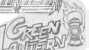
You see above a test logo, one of many, for a Green Lantern comic by Joe Quinones. He posted them at his blog, I really liked the one above, thought I'd share. I'd bet a million dollars (if I had it) that DC won't use it, though- it's too retro, not sleek and streamlined like they think all those GL comics have to look. Which is one reason, I suppose, that I don't buy Green Lantern.


Also, while I'm thinking about it, here's a BSBdG for Stan Lee, 86 years young today. I think its fair to say that without Stan, I wouldn't be here writing for you on such an infrequent basis.


Please stay tuned, I'm about halfway through a monster year-end Spinner Rack Junkie, which I hope to get completed today or tomorrow. Ciao, baby!

Thursday, December 18, 2008

Thursday, November 20, 2008


Sweet cover by Dave Johnson for a comic I'll probably never buy, since I've never really been much of a Punisher fan. Oh well.

Just wanted to put something up since I haven't done so in a while; thanks to work, a part-time graphics job, and real-world distractions and stresses I'm not getting a lot of time to sit and write, and not a lot of inspiration when I do...so, for the hundred thousandth time, please bear with and I'll have stuff soon- hopefully, a bunch of comics reviews if nothing else by the end of the weekend. Or not.

Friday, November 07, 2008

I'm a little surprised that I'm not seeing this at the comics news sites like Deppey, Tom, and Heidi...but hey, I was so impressed by this that I'll share and they can take credit later. Jill Thompson has posted three pages she found from an aborted Nightmare Before Christmas graphic novel adaptation, and I can't think of many more perfect matches of artist and subject matter. To be honest, I'm not that big a fan of the film, but these are wonderful- too bad that it didn't get greenlighted. Here's one page, click to see all bigga; for two more and the full story go here. And tell her Johnny B sent ya.

Wednesday, October 22, 2008


Anachronisms aside, this would be about six dozen kinds of awesome. This is just one of a series of James Bama Doc Savage/classic monsters and literary character mashups Keith Wilson has done- go here for the full set. I also want to read this one and this one. This one, not so much.

Found via the excellent Frankensteinia blog.

Friday, October 10, 2008

texa317_01

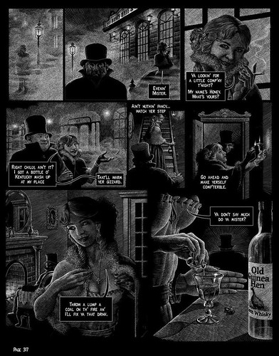
Check that page out! Isn't that beautiful?

Several times over the last (almost) six years, I've mentioned my love for the TEX ARCANA series by John Findlay, originally serialized in Heavy Metal magazine in the 80's, and continued to this day at Findlay's Tex website. It's an imaginative and whimsical mashup of humor and the supernatural, set in the Old West (a setting in which you don't always get the two mixed together) and brought to life by Findlay's insanely detailed crosshatch pencil style. It was a highlight of what was probably the most creatively fecund period in that publication's history, and I enjoyed it as much as anything that they ran.

But by the beginning of the 90's, I had stopped buying HM (and Tex had stopped appearing there before that). I always thought I'd get the collected trade someday, but it wasn't a priority, even though I had parted with my Heavy Metals in 1987. I still fondly remembered the series, though, and years later I was overjoyed to find not only Findlay's website, but to see that he had been doing new installments on a semi-regular basis! It wasn't perfect; the website isn't exactly crafted for ease of browsing- one has to click on a entry portal for each book, then click through each page (many are app. 20 long) to get to the new page of the story. The only way to know that he's updated is a tag at the bottom of the gateway web page (my lack of webpage building experience is showing here; I don't have the proper jargon I know), which actually isn't working right now. There's no RSS or Atom feeds, either, so that rules out subscribing via feed reader.

But I want you guys to check this out so much and follow it that I thought what I'd do is try to keep checking the site periodically for new pages, and when I found one I'd post a panel from the new page and a link. Hopefully Mr. Findlay won't mind if I draw attention to his site this way, without infringing on his copyright by posting whole pages (yeah, like I did above. It's a one time thing, OK?) or stories. I might try to email him someday to ask him to talk to his webmaster to improve the functionality of his site...

Anyway, so far, he's done four "books", the first three of which are collected in this publication, as well as available to read for free on the website.

Here's book one, book two, and book three.

Here's page one of book four, "The Story of the Woman in White".

You can read by clicking on the pentagram icon on the lower right hand corner of the page. Hope you dig 'em.


Of course, this is all © 2008 John Findlay.

Thursday, September 11, 2008


I've been seeing these "Marvel Masterpieces Artist Sketch Cards" all over teh intarwub for months now; I don't know where the hell you can get them, or what you have to do or who you have to know, but multitudes of the outstanding artists whose blogs I follow have scored them, and have been posting them for those of us, the less fortunate and less worthy but no less appreciative. The above, a Nextwave set, is only a few of the excellent sketch cards that can be found at Mike Maihack's Buffalog- Maihack has a charming, deftly streamlined cartooning style that I really like a lot. He doesn't really have them tagged so I can give you a one-click-shows-all kind of link, but if you go here, here and...here, with one more to come in the next day or so, you can check 'em all out.

I'm tempted to take one from somewhere, Photoshop out the art that's on the file, draw some of my own on paper, scan, and cut/paste. Boy, that sounds like a lot of trouble doesn't it? That's the price I pay for not owning a Cintiq, or some other kind of tablet. Oh well, c'est la vie.

Saturday, August 09, 2008


At last it can be revealed- look what I have!

I've been acquainted with Fred Hembeck for about five years now, since I started this internet blogging thing, and I've seen him do many fine illustrations in his inimitable style for many other people, but I never thought to inquire about getting one for myself since my income for that sort of thing is very limited. However, finding myself with a little extra cash recently, I thought I'd give it a shot and get my own original Hembeck. But who or what should I ask him to draw? Dazzler? Brother Voodoo? Ultra the Multi-Alien? (actually, that would be cool...) Tusky the Walrus? Nah. Then it hit me- none other than the Official Mascot of the Johnny Bacardi Show, Super-Hip! I thought Fred's style would be a natural for the character, so that's who I asked for. And Fred did not disappoint- first quoting me a very fair (to say the least) price, and then giving me not only Tad Jutefruice's swingin' alter ego, but also Tad, his Uncle Bob Hope and his talking dog Harvard-Harvard, Tad's rival Badger Goldliver, and the rest of the faculty of Benedict Arnold High School! Needless to say, I was blown away!

And there you see it, up above. Ain't it beeyootiful? Click to see it grande style. I've had it for over a week now, but as I've mentioned before the indigo iMac and its attached scanner are still down, plus it's a bit too big for the scanner anyway, as well as the one we have at my job. Fred's been running all the pieces he's done in this style lately on his own website, and he told me he was going to put mine up eventually, so I just figured I'd wait and grab his scan. And there it is!

Groovy, man! Outtasite!

Monday, July 28, 2008

cloakdagger2

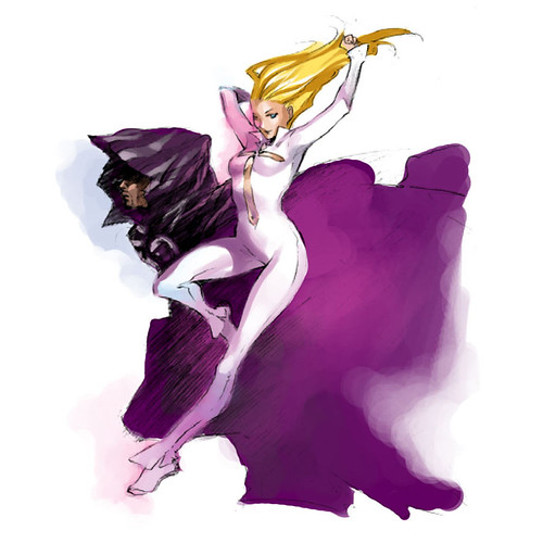
Again, I won't even attempt to recap all the Comic-Con announcements for ya, because that's the job of people who write for blogs with larger readerships than l'il ol' mine; some of which (I'd bet) even get a little financial remuneration for their efforts. I'm sure you know several that can hook you up with all the straight dope. However, one of those announcements that intrigued me was one that the above illustration refers to, a revival of Marvel's Cloak and Dagger characters- scripted by one of our own, Occasional Superheroine Val D'Orazio. Congrats to her; I think she's got an uphill battle ahead making these characters, who have always been on the Marvel Universe fringe (they've been teenagers for like 20 years, right?) and whose ludicrous, oh-so-"relevant" in that early 80's way origin merely serves to reinforce my entirely personal conviction that their primary appeal is visual (which led me to buy their first appearance oh so many years ago, as well as the miniseries that followed soon after, since you know that I often let my eyes convince me to make purchases that my head is not so sure about) readable. How's that for a convoluted sentence! Anyway, I liked 'em OK, and it wasn't until they got lost in the mid-80's Marvel mutant titles quicksand that I gave up on 'em.

Nice to see so many people who I have become acquainted with via blogging getting pro gigs like this. Maybe someday Marvel will greenlight my Modred the Mystic pitch*.

So this might help you to understand when I say that the main reason why this news is so interesting to me isn't so much Miz D'Orazio but her collaborator Irene Flores; the illo above, as well as those at the bottom of this page, show a lively line and some beautiful color. Despite the usual yawn-inducing manga stylings, which make it look at first glance like about a hundred thousand other young artists who learned to draw by tracing their copies of Fruits Basket (for lack of a better example at hand), upon closer examination there is a lot of subtle nuance going on that reminds me a little of people like James Jean, or even some of the early/mid-70's Filipino wave such as Alex Nino or Spain's SanJulian. Anyway, it remains to be seen if I'll put my money where my mouth is, but I do like the pieces I've seen. An Emily Warren is credited with colors on the series; it's unclear if she did the color on the above piece.

GB_WF_03

I also happened upon this illo via my Google Reader; it's an illustration of the lead character in the sadly missed and short-lived TV series Wonderfalls, found on the PunchPants art collective blog. One of these days I'm going to get the DVD set and watch the episodes I didn't get to see.


*only kidding. I don't even know how to write a pitch.

Tuesday, May 13, 2008

One of the most noteworthy stories from the last few days in the world of comics is that the great GENE COLAN is suffering from liver failure, and does not have adequate medical insurance to help meet his expenses. Writer Clifford Meth put out the word, and called for everyone all over the Blogosphere to send him cards, or post tributes on their own blogs, to try and help raise his spirits. I haven't gotten a card yet, but I realized that I had scans of at least three outstanding Colan-illustrated stories that he did for Warren magazines in the mid-60's, and I thought I'd post one of them to help draw attention to his situation, and also pay tribute to a man whose work has been absolutely essential- and who has worked on many seminal comics series in the last four decades, equally at home with the mundane and everyday as he is superheroes and the supernatural. The impression it has left on me alone, as I at first hoped to be a comics artist and later simply as someone who loved the medium, has been incalculable.

Anyway, I thought I'd try something new this time and since I recently set up a Flickr account, I thought I'd create a slideshow and post the pages there.

Click here to read "Fitting Punishment", which is admittedly a not-so-subtle EC-style tale by Archie Goodwin with a somewhat improbable ending...but Colan's wonderful atmosphere-enabling inkwash technique and his vertiginous, cut-and-paste-style page layouts make it something special. See if you agree. If this slideshow doesn't work properly, pages out of order, etc., please leave a comment and I'll just repost each page here.

ETA: I think I should make it a bit clearer that many efforts are underway to raise money to help the Colans in their time of need. I had hoped that those who would click on the links above would find their way to the proper venues to get information on how they can help...but I'm thinking I should just come right out and put it here. Loath as I am to link to Journalista, Deppey is spotlighting the information (I'm assuming) every day for the near future, so click here to get the info written in a more concise, informative, and entertaining fashion than I can manage, I'm sure. Basically, you can bid on eBay Colan art auctions, or send money directly to them via PayPal- their account is genecolan@optonline.net, and you'll probably want to put "donation" somewhere in the comments so it will be easier to find for them. This is probably what I'll do later on this week when I get paid.